Nov 30, 2008


Hi, everyone!!!
With this work, I chose Futura typeface as head line and Times New Roma typeface as body. Besides that, I tried make it as magazine so I arranged it followed column style. After researching Neville Brody, I quite step on the world of typography and I really love it. Hope you like my magazine and Neville Brody. Feel free to comment!!!

Nov 23, 2008

The end of the world with Photoshop


Hi everyone!!!


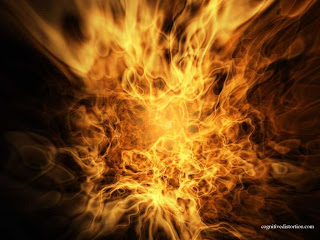
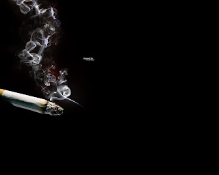
This is 3 pictures I used to create my work-The end of the world. I would like to show you it after I combined 3 pictures together by Photoshop software


Step 1: Create a new file (Ctrl + N) with whatever size and then fill it by black color. After that, you drag the earth picture into it. Use pentool to create selected field (one piece of the earth picture, it belongs to you)
Step 2: Click right-click and then choosee the make selection-->delete
Step 3: Create a new layer below earth layer and open the cigarete picture. Choose the suitable selected field by magnetic lasso tool
Step 4: Duplicate this layer and arrange them to hide the cut line
Step 5: Use the brush tool and choose the black color. Draw it below cigarete layer
Step 6: Cut the suitable fire picture and drag it to above cigarete layer. Choose the blend modes (color dodge or overlay)
Finish!!!
You can add other pictures to make other interesting picture (I added insect picture)
Reference:

Nov 22, 2008

Creating a Letter with Illustrator


Hi everyone!!!
This entry I will show you my work that is creating the letter "L" by Illustrator software. I created the 5 letters "L" by using Pen tool. I will count to follow the order from left to right and from 1 to 5
  1. That is just the normal letter L. I just draw as a normal capital L letter
  2. I tried to draw the special letter L so I drew the letter L as cartoon style. Do you feel it looks like as leg wearing NIKE shoe. Besides that, I also drew wings as a Greek God-Hermes
  3. I drew the other letter L and after I finished it I felt it doesn't look like the letter L. (T_T)
  4. I drew the other letter L again and I put it eye, nose and legs
  5. Finally, I drew it as Vietnamese calligraphy style

Hope you enjoy my work and receive your any comments. Thanks for reading

Nov 15, 2008

Colorful Rainbow by Photoshop


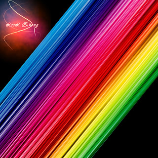
A super simple pratice with Photoshop is to create the colorful rainbow. It will help you see the color from bright to dark clearly. In this entry, I would like to show steps how to do this and hope it help you clearly about some filters in Photoshop
Step 1: Open a new document 1000px * 1000px, and fill it black
Step 2: Create a new layer and fill it white (put it in the top)
Step 3: Filter-->Render-->Fibers (Variance=20, Strength=4)
Step 4: Filter-->Blur-->Motion Blur (Angle=-90, Distance=999)
Step 5: Go to blend option and choose Gradient Overlay (Blend mode=overlay, Style=linear, Angle=0)
Step 6: Layer-->Smart Object-->Convert to smart object
Step 7: Duplicate layer (Ctrl + J) and Filter-->Other-->High pass (Radius= 10px)
Step 8: Merge 2 colorful layers and resize it
Step 9: Free transfrom the merged layer and Go to Image-->Adjustment-->Level (Chanel=RGB, Input level= 60; 1; 255).
Finally, I hope this entry will be useful with you and hope to receive your any comments

Nov 12, 2008

Make up by Photoshop-Good Good ^-^


Before


After
Hi Everyone!!!

Do you see the difference between 2 pictures? The model on this picture has a pale complexion so I used some tools of Photoshop to make up for her to be ruddy. This entry I want to share with you how to do that
Step 1: Use Polygonal Lasso Tool to choose the pale complexion
Step 2: Image-->Adjustment-->Selective colors.
Step 3: Image-->Adjustment-->Levels
  • When the table opened, with chanel you choose RGB. In Input Level, type 20-1,05-255
  • With chanel you choose Red. In Input Level, type 65-0,7-255
  • With chanel you choose Green. In Input Level, type 15-1-255
  • With chanel you choose Blue. In Input Level, type 5-1,25-255
Step 4: Use Lasso Toolto choose the lip. Go to Adjustment-->Selective color
**NOTE: You can change the number to be suitable for your work.

Nov 9, 2008

Practice with Glow effect


Hello, everyone!!!
Today, my topic is glow effect in photoshop. It is very useful effect of PTS. Hope you enjoy it
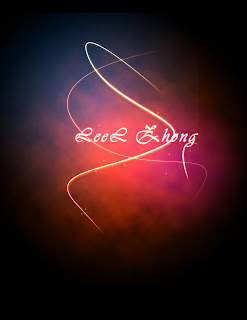
In order to do this work, firstly I began with radiant tool with brown color and black color. Secondly, I create a new layer--->use filter tool--->choose render cloud--->with this layer, choose overlay and opacity about 30%
Thirdly, use pen tool to draw the curve--->choose the brush tool and choose brush--->switch to pen tool--->right click to choose stroke path--->right click to delete path
Finally, add some glow in blend mode to complete this work.
When I finished curves and added the text, I added some other color by using gradient tool. You could see I added the blue and violet colors to make this picture are cooler.
Thanks for reading. Hope to receive your comments.

Nov 3, 2008

Gestal Practice 2


With this work, I tried to apply the gestal theory. After I added the text into the flower picture, I used line tool to draw lines and I put it as rectangular. Do you feel your mind will close the blanks between the 2 lines automatically. That is closure. My work looks very simple. Maybe I should try to pratice more...
Hope you comment for me to improve gestal theory. Thanks a lot

Nov 2, 2008

Gestal Practice


Hi everyone!!!
With this work, I also tried to apply gestalt theory into it. I used 2 flower pictures, one is main picture and I use second flower picture to cut and paste it into main picture. The color of pasted flower is white and it has same color with the main picture so I change the color from white color to yellow color. When you see this work, which flower are you attacked mostly???Is that yellow flower?
If the answer is Yes, I am successful to apply similarity with this work. Because most flowers in this work are the white so when I added the yellow color, it will make flower easy to identify. Besides that, I also pasted the flower one more, resized and arranged it to center of the yellow color. After that, I changed its color to be green color. I used overlap to make a strongest gestalt.
If the answer is NO. Haizz... I must try to practice more....^-^!
Thanks for reading and hope you comment